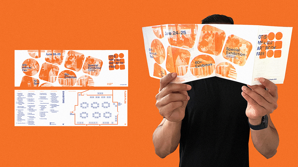
Otis College Of Art & Design Annual Book Fair
Our design for the college book fair identity is an embodiment of collaborative student work
within a shared space. It aims to evoke the tactile sensations and creative process through
a building block formation. These shapes symbolize our learnings and growth. The identity
incorporates layered elements, including hidden branding and a stencil overlay, adding
interactivity, playfulness, and a sense of joy in the discovery.
(In Collaboration with)
Drawdown Books.



(02/08)
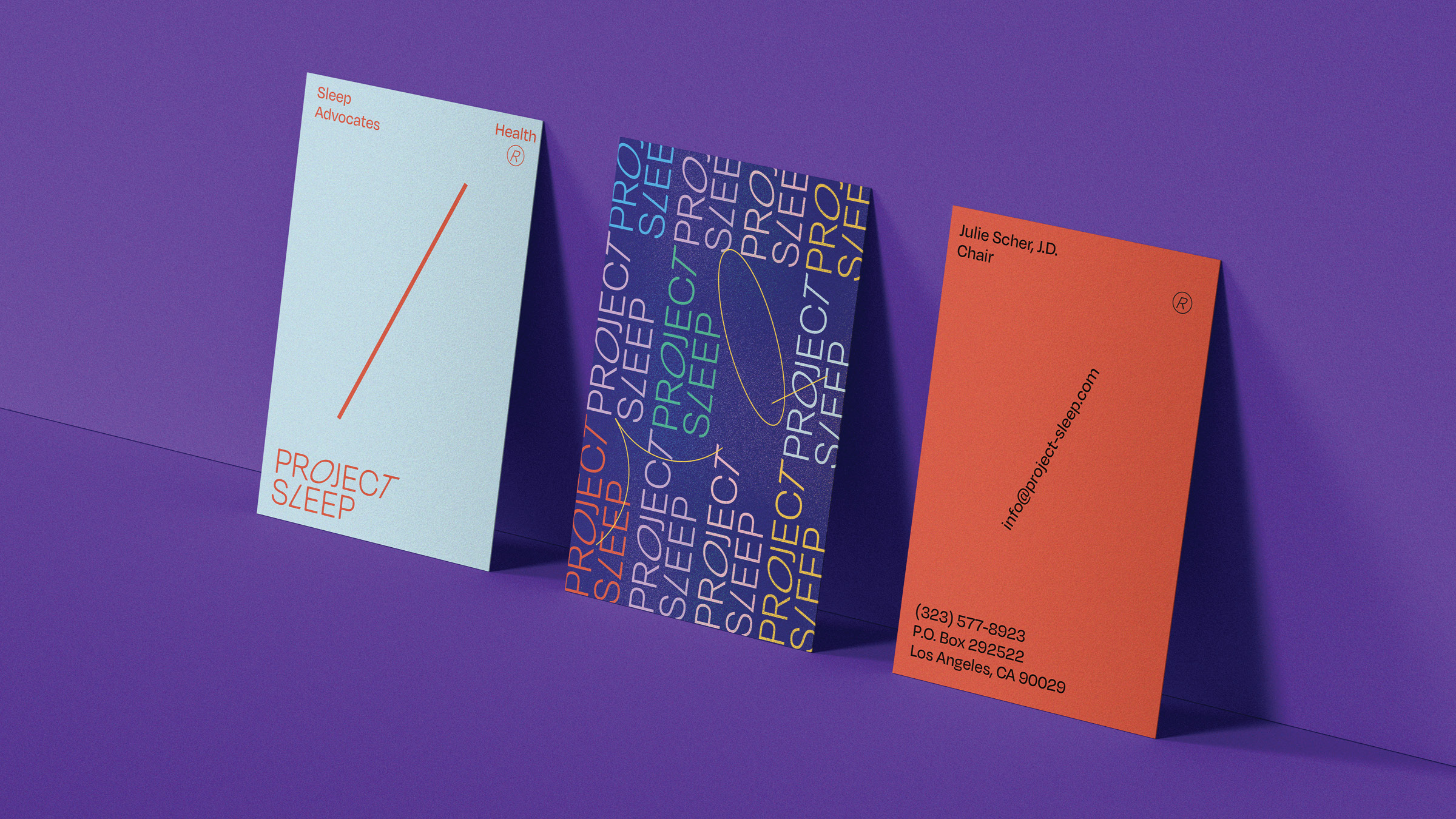
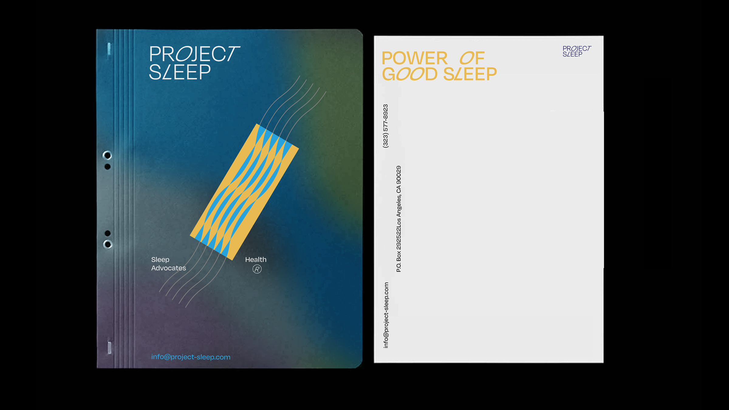
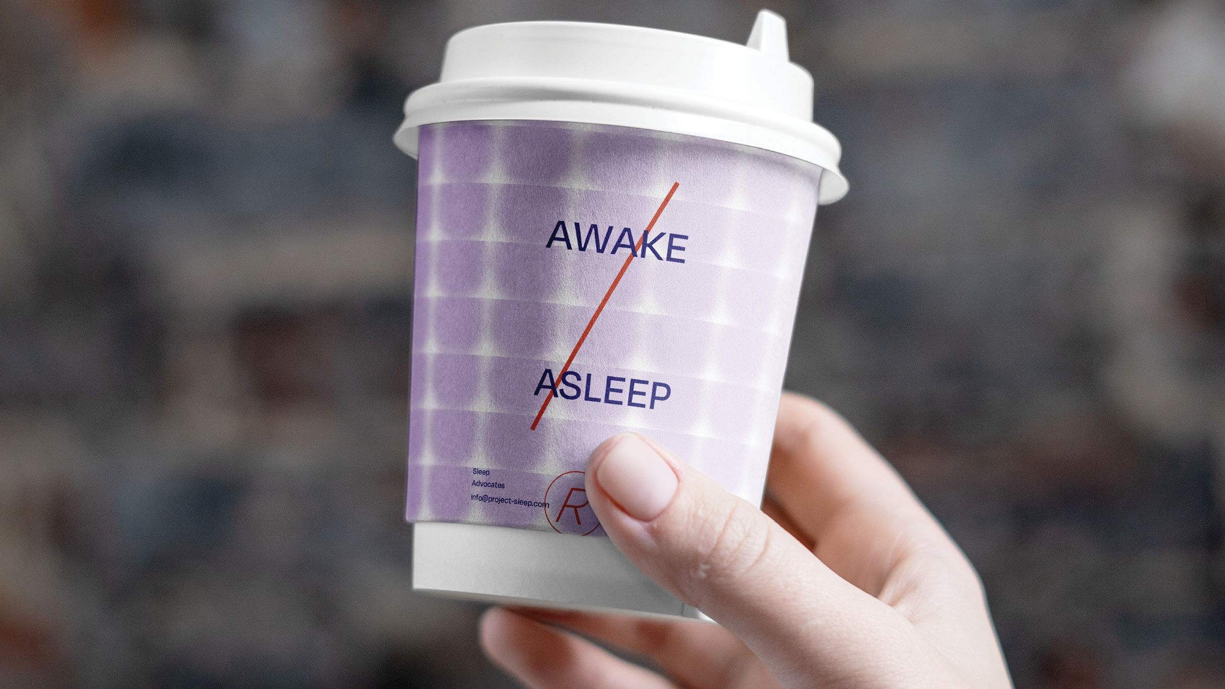
Project Sleep
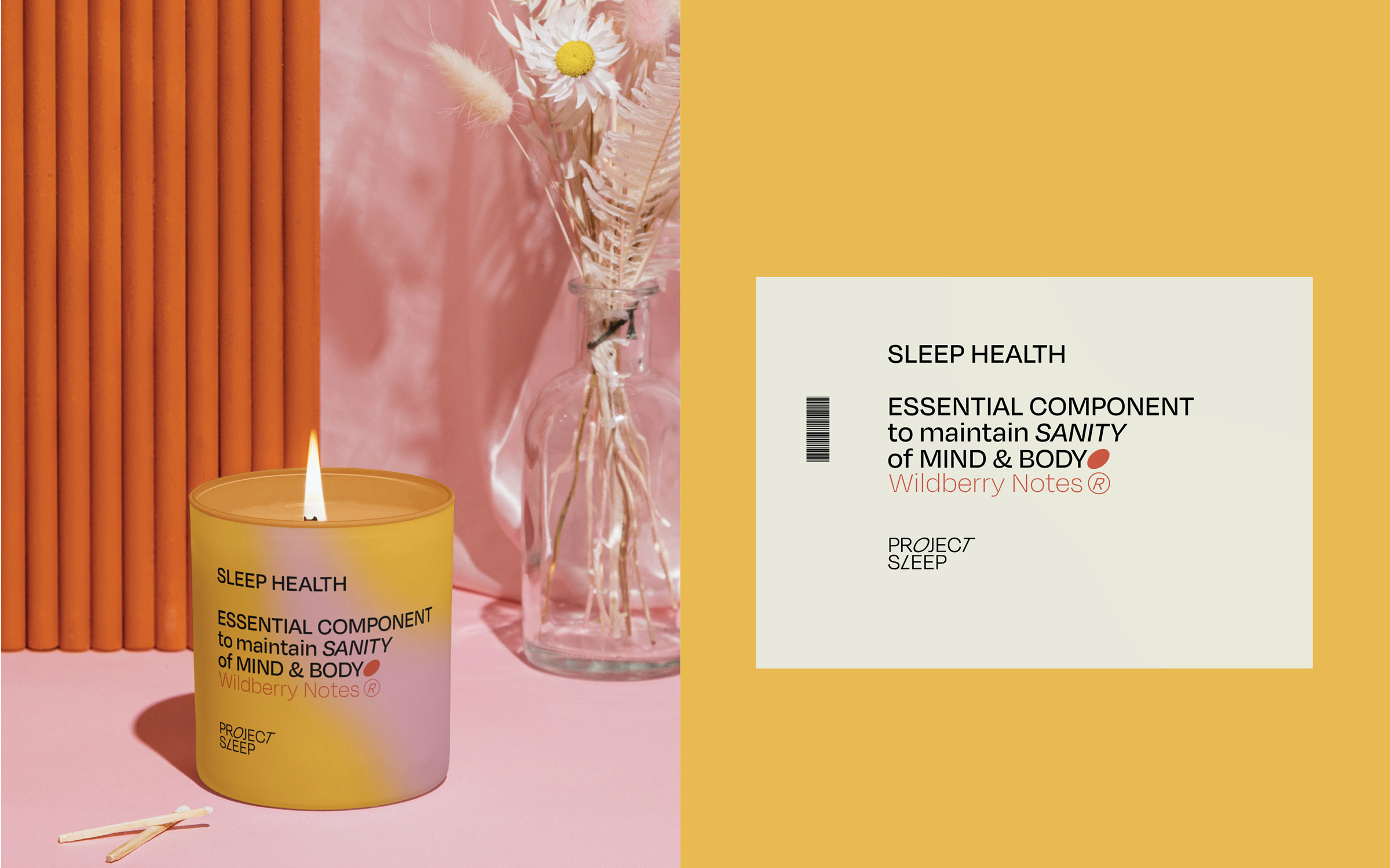
A rebrand of Project Sleep, a non-profit dedicated to raising awareness about sleep health and sleep conditions. The aim of the rebrand exercise is to enhance brand recognition for Project Sleep. It’s achieved through building a product line for the non-profit’s marketing materials. The key in the visual messaging for the rebrand is ‘simplicity’.
︎︎︎


Kahlon Emporium
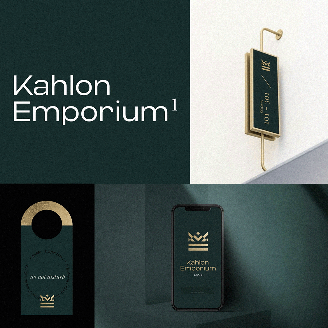
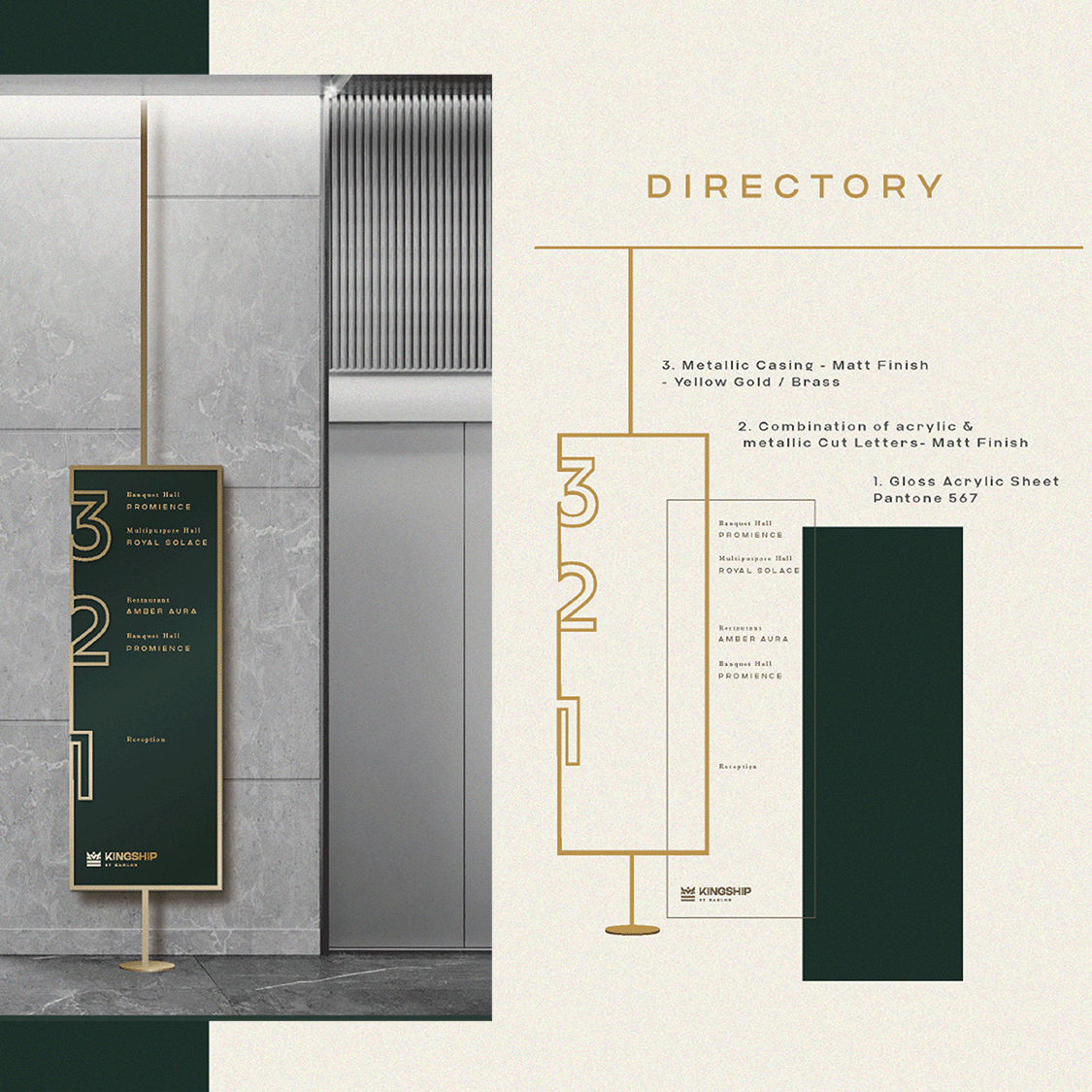
For Kahlon Emporium in Lucknow, India, I envisioned a brand identity that artfully weaves together history and modernity. We christened it 'Kingship,' a name that pays homage to the city's royal legacy and the Kahlon family's enduring heritage. The choice of a deep emerald color scheme exudes an air of sophistication, and I embraced minimalistic design with graceful lines, which elegantly shape a recurring crown motif throughout the complex.
Our approach also extended to 'Cilantrro,' the restaurant within the complex, which maintains a distinctive visual language that harmonizes with the overarching theme of the project. In sum, my design for Kahlon Emporium is a testament to the fusion of Lucknow's regal past and contemporary elegance, making it a symbol of timeless allure.
Our approach also extended to 'Cilantrro,' the restaurant within the complex, which maintains a distinctive visual language that harmonizes with the overarching theme of the project. In sum, my design for Kahlon Emporium is a testament to the fusion of Lucknow's regal past and contemporary elegance, making it a symbol of timeless allure.
︎︎︎




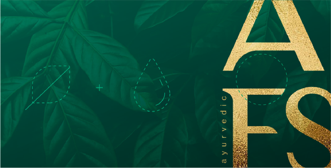
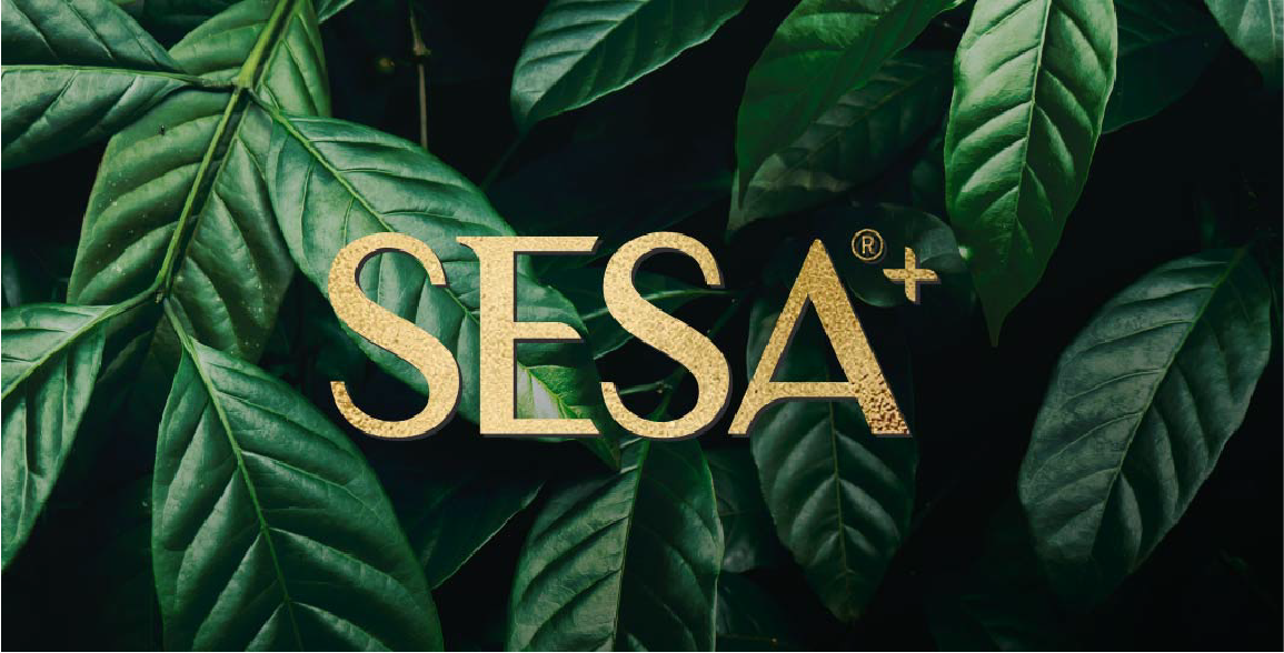
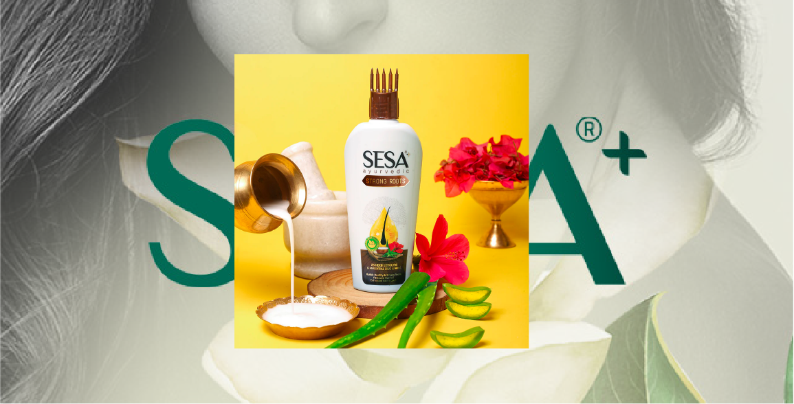
Sesa Hair Care
Sesa is a hair care brand that has its own unique personality and culture, in stark contrast to an industry filled with ‘more of the same’ type approaches. The existing branding was too bold for products with its roots in nature and ayurveda. The new Sesa logo has softness yet modern, contemporary and more human. Inspired from the contours of a natural form, Branding uses curves and arches like that of a leaf. Balance was created for it to work wonders in both mass and premium markets.
︎︎︎

